Our New Look: #ActivateTheCure
You may have noticed — we have a new look!
We are excited to announce that the Emily Whitehead Foundation has re-branded. Over the last few months, our co-founders and the "Thinkers and Doers" at Rowland Creative have worked together to create a new identity for the foundation. We hope you love it as much as we do!
Finding Our Identity
Two years ago, when we were just about ready to announce that the Emily Whitehead Foundation had been created, we realized we were going to need a logo. A gold cancer ribbon seemed an obvious choice—the ribbon is a well recognized symbol and gold is the color attributed to childhood cancer awareness. When we started, we didn't have an identity yet. We had an idea of the direction we wanted to go, but over the past few years we've been able to better define our organization, our mission and our goals. As we grew and developed as a foundation, we kept in mind that we wanted a new look—one that was unique to us and representative of the identity we have since established.
In traveling the U.S. and Europe to raise awareness and share Emily's story we have learned that, in addition to raising awareness, there was a need to inspire action. We can make people aware of the need for better treatments for children with cancer, and the need for more research funding to be able to develop these treatments, but if we can't inspire action then we cannot make progress. We want to motivate and encourage others to get involved. We know from our experiences that a lot of small efforts can create big change, and that everyone can do something to help.
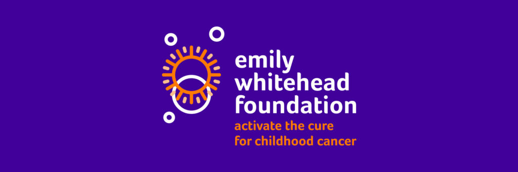
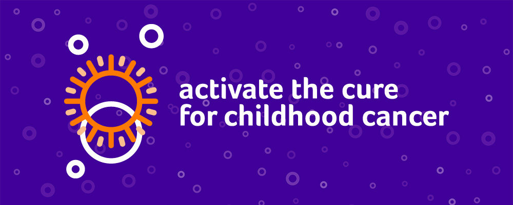
With this in mind, we enlisted the help of Rowland Creative to come up with the perfect logo and tagline. After a few months of thinking and discussing, we were presented with the new Emily Whitehead Foundation logo and our new tagline: Activate the Cure for Childhood Cancer
About Our New Look
In discussing the designs, we knew we wanted something bright, fun and optimistic. We also wanted something that looked scientific to reflect our mission of supporting immunotherapy treatments such as CAR T-cell therapy. Rowland Creative delivered with a logo that reflects those things and more.
The circles remind us that, in establishing a foundation, our journey comes full circle— helping kids and their families going through the same fight that our co-founders did before them, and giving back to the community that supported them in that fight. But that’s not all that those circles represent. When our co-founders first saw the logo, Kari immediately thought of a T-cell, while Tom was reminded of the sun shining light on a new day and new beginning.
Paired with the word “Activate”, the duality of this logo became even more apparent. When the T-cells are taken to the lab to be modified for T-cell therapy we often say that the cells are being "activated to fight cancer". Now, not only are we supporting the research that is activating cells to cure cancer, but we are also activating others and encouraging everyone to take an active role in fighting for this cure.
What do you think about our new look? Let us know in the comments! You can also tag us on social media using our new hashtag #ActivateTheCure.
If you received our recent newsletter, you know that we promised two big announcements in January — the second will be announced soon!